A Mid-Mortem: How We Got Here and Where We're Going: Part 3
I ended the last post at Build 9 because it was getting long, but also because build 10 is when I finally started tagging my builds in bitbucket. That isn't hugely consequential, but it's going to make it a lot easier now to identify which builds had which changes as I write this part. Because of that, this part is probably going to be the most structured. I'll include patch notes for each build and some commentary about what I changed and why when there's something worth talking about.
Build 10: (9/11/23)
- Changed Combat system to make it more intuitive
- Changed Banks Tech to make it more beneficial
- Expanded help Menu to give better guidance to new players
- Updated messaging on Connection Panel for better clarity
- bugfix: game over not properly triggering when winning a combat that moves your units onto opponent's starting hex
So I changed the combat system again, it's been a constant battle to figure out because I want it to be easy to understand but also complex enough to allow players to use it strategically. I think it's been getting better as I've been iterating on it, but I still changed it a few times after this and I'm not convinced it's done yet. This build also aimed to improve the new player experience by expanding the 'help' menu to cover everything a new player might need to know. I'd entirely been testing with friends who I could explain the game to live, but I want it to eventually be approachable on its own. This change broke out different information into separate sections so it wasn't all just in one wall of text like before. In that same spirit of making the game more approachable I changed some messaging on the Connection Panel that players first saw when starting the game.
Build 10.1: (9/14/23)
- bugfix: Fixed an issue that was preventing players from connecting to a game they were invited to from Steam
Build 10.2: (9/14/23)
- added ability to change the appearance of the tabletop
I quickly pushed out two minor changes. The first (10.1) was an important fix to a bug caused by me not initializing the steam transport when the game started. I had been doing all my testing locally without using steam, so I didn't even realize I broke this until I was trying to connect with a friend over steam.
The other change was just something silly I added in to let players change the tabletop background appearance by clicking on it so there was something to do in between turns. I'm going to pull that out at some point I think, but I think it's kind of funny for now. You may notice that some of the screenshots below have a different tabletop background than others.
Build 10.3: (9/20/23)
- Changed Combat system (again) to increase casualties and reduce steamrolling.
- bugfix: Exit game buttons now work properly
I broke the exit game buttons without realizing it so I fixed them here. Also changed the combat system again because the winning side in a combat was gaining too much of an advantage.
Build 11:
- Changed resource production of mines to now produce resources based on hex height and number of units on the hex
- Changed combat logic to reward the winning side when battles are very uneven (one side has 3x+ or 6x+ the strength of the other side)
Again I changed the combat system. Like I said, work in progress. The change to mines was designed to give more reason for a player to actually modify terrain height and to create some asymmetry in the way farms and mines operated on the gameboard. With this change you could stack units on a single mine and build it up to max height to get it to produce far more stone per turn than before. This change was an improvement, but testing showed me that it was producing way more stone than made sense in the game and I eventually modified it in a later patch.
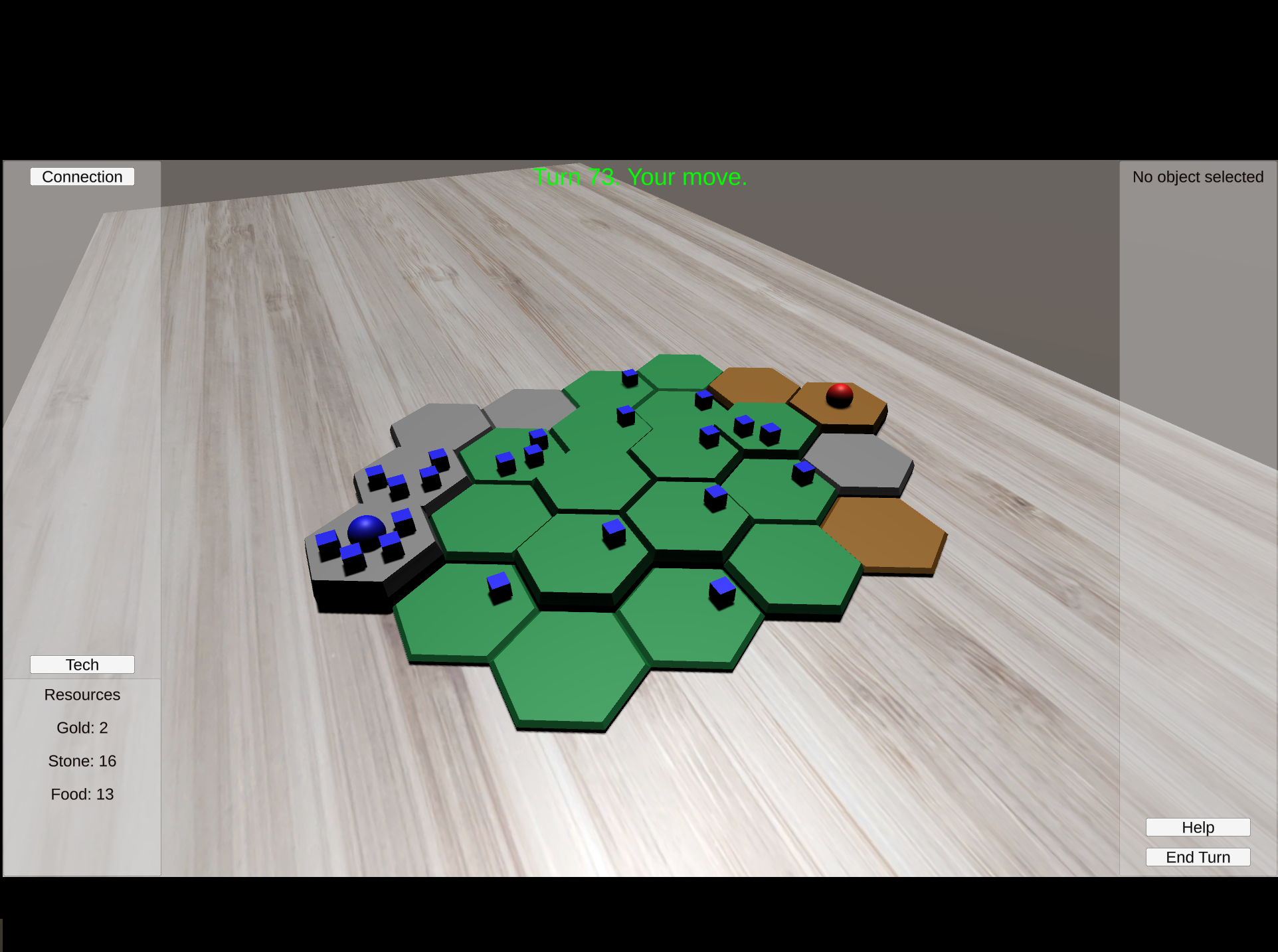
Build 12: (10/2/23)
- Added a pre-game lobby.
- You can now play again when the game ends without having to close and reopen the game
The short changelog here doesn't really do justice to the significant refactor that happened under the hood here. Up until this point the game was launching into an almost blank 'MainMenu' scene with just a single button saying 'play game'. Pressing that button took you into the game scene, where a new menu was presented. From the user perspective this was really the main menu where you created a game and there was no need for the blank MainMenu. As a player, you would start a game and be taken into it immediately, then invite your friend and only be notified that they joined if you opened up the connection panel. This had been working well enough for my own testing, but I wanted to make the experience better for new players. So I decided it was time to add in a pre-game lobby, and along with that I decided I'd see if I couldn't add in support for more players at the same time.
I knew that I had initially cut some corners in the way I was generating the gameboard. It wasn't anything too severe but there was some work needed, and there was no way the little map I had been using was going to be able to fit 4 players and be fun to play. So I dug into my grid generation code and removed my hard-coded starting locations in favor of positions determined by the grid size. In doing so I added in two booleans that let me change some simple game rules: `isSpawnHexOnEdge`(does the player starting hex appear on the edge of the map or inset by one hex) and `gridRemovesCorners`(a way to keep the existing appearance I'd been using or instead create more of a rectangular map). Working on this helped me also solve a problem I'd been running into occasionally but couldn't reproduce consistently: sometimes the camera for player 2 was spawning in on the wrong side of the table.
With the grid generation improved I was ready to add in a pre-game lobby. Everything up to this point had been built around the idea that player 1 created the game and then player 2 joined it in progress, so I had a lot of changes to make. To summarize it quickly, there were events happening in the gamescene that were triggered by players connecting, and there were some previously correct assumptions I had made about the state of the game/board when a player connected that were suddenly not true anymore. Working through those assumptions took some time but I got there. Then I had some UI tweaking to do and some state management work to make sure that the lobby worked the way I wanted it to, allowing players to connect and disconnect without breaking the lobby or leaving it in a state the would break the game. There was also another aspect to it, I wanted the players to be able to feel that they were in a lobby, so every client needed to be aware of the total player count in the lobby. I might go back eventually and show other player info on the lobby screen, but I didn't prioritize it at this point.
There's a lot more detail I could go into, but that's enough already for a high-level view. When I finally was ready to 'ship' build 12 I tagged it on bitbucket before realizing I hadn't yet added a 'main menu' button on the game-over screen. So one of my initial objectives, allowing players to play again without closing and reopening the game, wasn't possible. I made a quick addition and tagged the new build as 12-actual, and that's the one that actually got uploaded to itch. I think at this point I didn't think the images on the itch page were all that representative of the game anymore, so I added a new one.
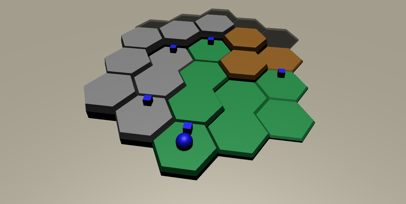
Build 13: (10/24/23)
New units:
- Geomancer: Allows for terrain modification
- Shaman: Blocks terrain modification, can generate knowledge
- Fighter: A unit with higher attack power
- Guard: A unit with higher defense power
New Concept (Buildings):
- Temple: produces knowledge if its hex is occupied
- Camp: Increases resource production limit and occupancy limit on a developed hex
- House: increases unit occupancy limit
- Barracks: Create Fighters and Guards
New Resource:
- Knowledge: Produced by Temples
Tech Changes:
- Removed old techs and replaced with new ones which require Knowledge for purchase
Gameplay changes:
- Modifying terrain now requires a Geomancer instead of using any nearby unit type.
- Opponent's Terrain modification can be blocked on a hex occupied by a Shaman
- Non-Dirt hexes have a lower limit on unit occupancy
- You can now play with 2-4 players, up from just 2.
Bugfixes:
- Clicks on UI elements no longer "go-through" the UI and click items in the game.
This was and still is the biggest patch I've released so far. The patch notes give a good summary of everything that changed, so I'll walk through the changes in order and talk about them a bit.
I had been wanting to add in more unit types for a while, and in my head I had a concept of a Geomancer unit that could manipulate terrain. So far, terrain manipulation just required any nearby unit, so I decided to remove that and instead make the Geomancer the only unit type that could modify terrain in hexes adjacent to it. I thought it would also be interesting to add some counterplay to it by adding another unit type, the Shaman, which blocked an opponent's attempts to modify terrain in adjacent hexes. To distinguish these units from one another and the basic units, I made a little addition to the unit model, which essentially amounted to giving these new units little hats. The Geomancer got a sphere and the Shaman got a cube.
(10/7/23)
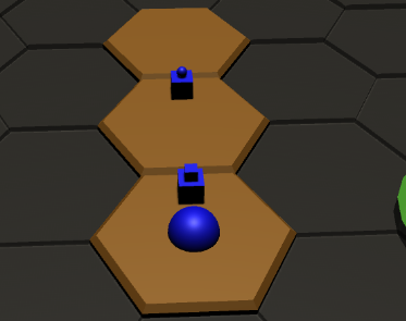
Before I had much chance to test the way these new units changed the game, a friend of mine was visiting and we took the chance to play the game together. Somewhere around halfway through I realized there was a critical issue with the Shaman design, and hoped he wouldn't notice before I got to his base. But he did, and we eventually got this point: (10/10/23)
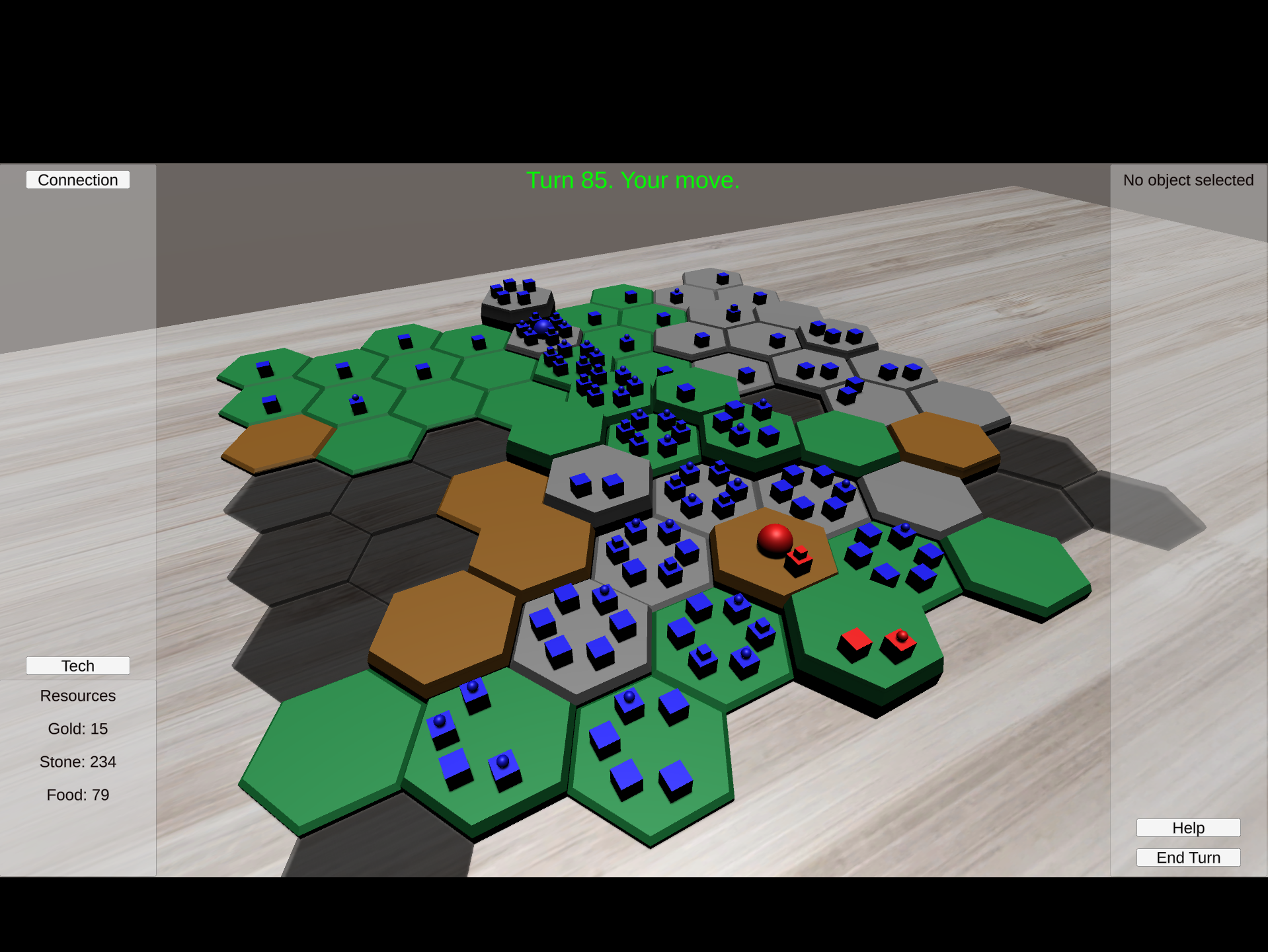
If you've been paying attention you can probably see the problem. If not I'll explain. His(red) shaman sits on his starting hex at height 3, preventing terrain modification on all surrounding tiles. None of the surrounding tiles are high enough already to allow units to move to his starting hex, so we're stuck in a stalemate as long as the shaman is there, and there's nothing I can do about it. You might also notice the abundance of resources on the left panel, but that's a separate design issue. The biggest thing with this playtest was that I realized the Shaman were far too strong. I nerfed them down to only being able to block the hex they occupy and now I think they're probably too weak, but that's an issue for another time.
The overabundance of resources bothered me too. A resource-management game loses its challenge if there are more resources than you know what to do with. So I removed the techs I had in the game that globally improved your hexes and pursued an option more focused on modifying individual hexes more strategically. To do that I needed to add in a new concept: buildings. Because of the work I'd done already and the special important of the starting base, I built Buildings independent of bases, they're not technically the same thing. That said, they do share some common functionality and I might eventually refactor bases to be a type of building.
Buildings weren't all that complicated to add in. Each one needed its own model, and I knew I wanted them to be unlockable in the tech tree. One notable aspect of buildings is that they aren't 'owned', but rather built on a hex. If you occupy a hex with a building, you get the benefit of that building and it's treated as yours, but if you abandon the hex you also abandon the building. To convey that in-game, I left all buildings solid white rather than giving them a player color. I've had mixed reviews on this, and might consider granting them a player color but changing it if ownership changes hands, perhaps letting players keep ownership of the building even if they don't occupy the hex. But the jury's still out on that one. (10/18/23)
The tech tree also saw it's first actual progression node, where the 'camps' tech is now a pre-req for the 'houses' tech.
I then introduced a third tech: 'barracks'. This unlocks a building that allows for the creation of 2 new unit types, the 'fighter' and the 'guard', inverses of one-another with improved attack and defense, respectively. This of course required a significant change to the battle system which had previously only supported units with 1 attack and 1 defense.
Around this time the larger map had really grown on me and I was using it by default, but that meant that the simple camera rotation I had built before wasn't quite cutting it. I wanted a bit more control of the movement, so I expanded the camera movement to support a more standard WASD free movement and kept the previous Q/E/Mousewheel interactions.
I also added in another building, temples, along with a new resource they generated: knowledge. This is continuing the pursuit of interesting player choices at all stages in the game. I was finding that using only stone/food in the tech tree didn't give enough room for meaningful decision making, but giving players the choice to invest in knowledge production would be more interesting. Also attempting to help the shaman find more purpose I decided that a shaman occupying a temple hex would produce additional knowledge. The actual knowledge values are still a work in progress, but heading in the right direction.
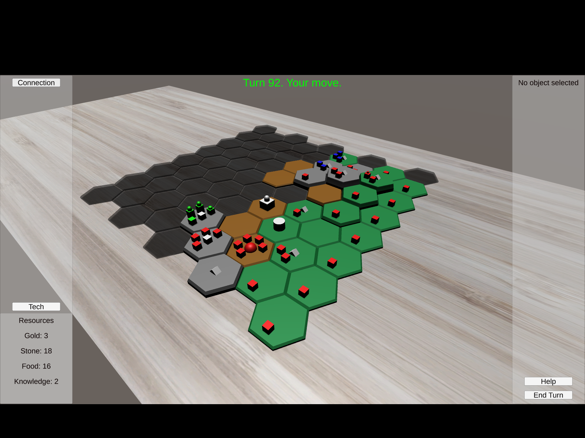
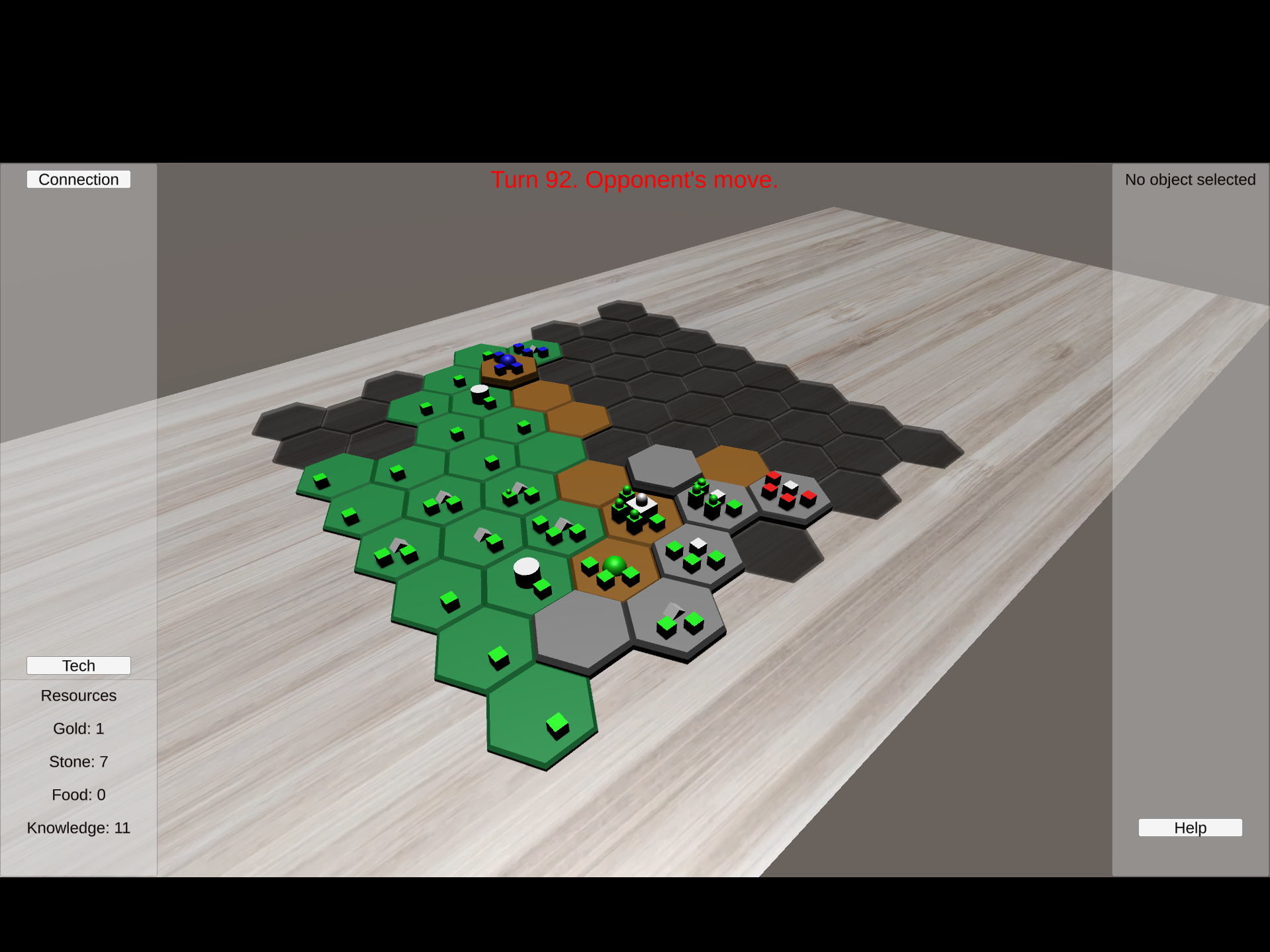
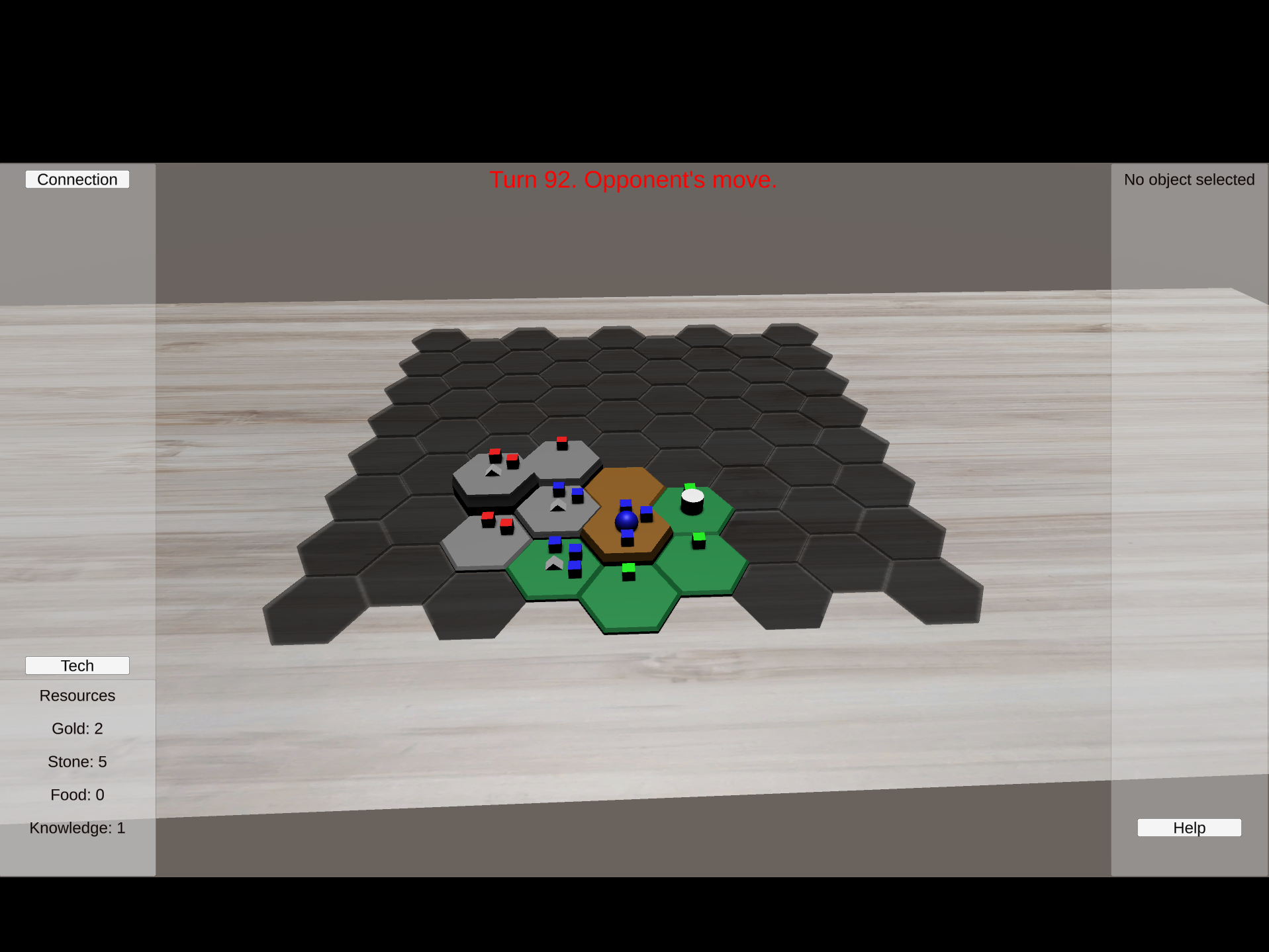
I'd set out with the pre-game lobby change in the previous patch to allow for more than 2 players. At this point I finally put in the last bit of work to support more than 2 players. This required some updates to initial camera positioning based on spawn points with different player counts, which ultimately made the code better even for 2 player. The introduction of 4-player also created a new situation in-game: a player could be eliminated but the game needed to continue. Previously I was triggering game-over when an opponent's base as reached, now I needed to eliminate a player from the turn order but let the game continue until there was only 1 left. Because of the initial starting position changes, it was easier to build support for 4 player before 3 player, but I went back and added in 3 player after. So the game now supports 2-4 players! Here it is from 3 different perspectives in 3 player(10/24/23):
Build 13.1: (10/28/23)
- Made improvements to combat to better support units with different attack and defense values
Build 13.2: (10/28/23)
- Added a new button on Selected Hex Panel: Select All Units
Combat wasn't behaving the way I wanted it to, so I modified it again. And I added a quality-of-life button for a selected hex so players don't have to click so many times to select their units on the same hex. Here's a sample game I played at this point:

Build 13.3: (11/1/23)
- Bugfix: Steam games were limited to 2 players, now properly supports up to 4 players
I tried to play a 3-player game with some friends and found it not working. That was easily fixed with a single character change in the code, because you have to explicitly tell steam your max player count when creating a lobby and I'd set it to 2 way back when I first added that code. Updated it to 4 and I'm now pretty sure more than 2 player games do actually work, though testing it requires actually getting multiple people online at the same time so I haven't verified that yet.
Build 14: (11/7/23)
- A confirmation dialog now pops up if you are making an attack against an opponent so you can see a summary of your selected units and the target hex and avoid sending your forces in by accident.
- added help text for Barracks
- Pressing the 'Home' button now resets your view to look at the center of the map so you won't be lost forever if you wander away from the gameboard.
- Changed lighting and object appearance so that edges are now the player's color instead of solid black
-bugfix: units with 0 movement were able to attack, no longer are.
One of my friends was getting pretty frustrated by misclicking and accidentally sending his units in on a suicide mission. To address that I added in a confirmation dialog that pops up any time you send units into combat. This shows a short summary of your selected units and the target hex so you can confirm you're making the attack you mean to. In that same playtesting session his camera somehow got so far away from the gameboard that we couldn't figure out where it was anymore. To make sure we don't get stuck in a situation like that again I made the 'Home' key refocus the camera on the center of the gameboard.
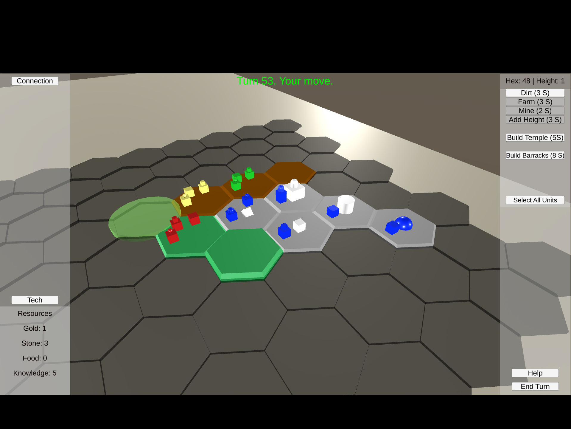
Also unrelated to anything else, I got a bit tired of the top-down lighting always making every object in the game have black sides instead of their intended color. So I spent some time changing the lighting and ended up with 4 lights in the scene shining down at an angle from different corners. I took some screenshots along the way but the actual final result looks a bit better than them:

If you've read through this whole post, you're all caught up on the current state of the game, thanks for tuning in. Feel free to leave a comment below if you have any and check back in before too long, I'm planning on writing up more devlogs in the future as I add more to the game, but I'll likely keep them shorter and post them alongside new updates.
If you're interesting in checking the game out for yourself you can find it linked below and reach out to me if you want someone to play with or if you've got any thoughts you'd like to share.
Get Topoforma
Topoforma
Development Build
| Status | In development |
| Author | soclosesam |
| Genre | Strategy |
| Tags | Multiplayer, Turn-based Strategy, Unity |
Leave a comment
Log in with itch.io to leave a comment.